Manulife Mobile
Manulife provides group retirement and benefits services to other businesses' employees. Manulife Mobile allows Manulife account holders to make and view their benefits claims for various medical, dental, and well-being services as well as see how their retirement investment portfolio is performing.
- UI/UX Designer
- Co-op
- September - May 2020
- View on App Store
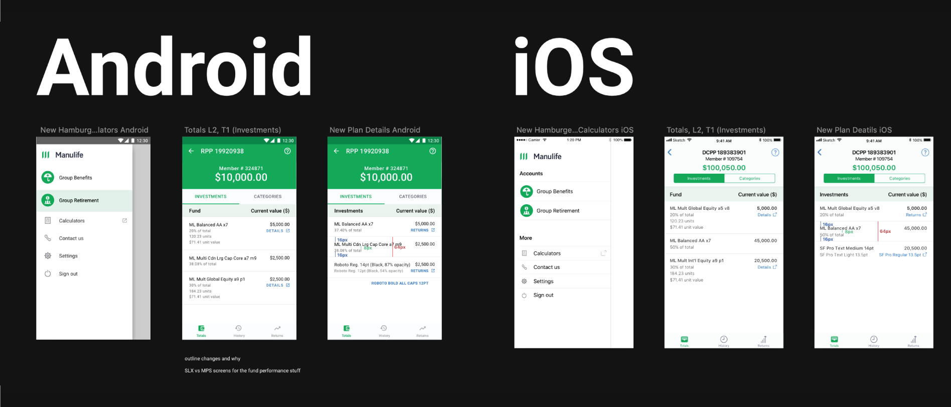
At Manulife, I worked as a Mobile UI/UX designer on a young design team of just four designers, including myself. The team consisted of a UI/UX lead and three designers, each dedicated to a different project. My design team was my resource for brainstorming, design feedback, and establishing patterns for the first steps of our design system. As the sole UI/UX designer on the Manulife Mobile Group Retirement project, I worked with my project team to set priorities, gather requirements, validate technical feasibility, and deliver high-fidelity mockups uniquely for iOS and Android, as Manulife Mobile had a commitment to delivering native experience to users of both mobile operating systems. During my stay, some of the challenges I had to tackle were:

Reinstating UX practices on my project team
Although this was a co-op position, I was filling a full-time role. For reasons outside their control, the team didn't have a UI/UX designer for a while before I joined Manulife. As the sole designer for my team, it was up to me to explore the problem, brainstorm flows, create wireframes, and ensure that at every stage the user is being put front and center.
Advocating for the user through research and design
As a designer, developer, and business student I was able to work with everyone on my project team and empathize with their stance, while still vying for the user experience. Having my diverse background allowed me to present design rationale and gather requirements in different ways and contexts, tailored to the current audience.
Responsibilities
- Establishing feature priorities with the product owner
- Mapping out requirements with the business analyst
- Creating design briefs with extensive research
- Designing and validating technical feasibility with developers
- Evaluating success by studying the metrics

Making user-centered design matter to my project team
All too often, as designers we sit down, open up our design tool, put our heads down, and look up once they we have a finished design to pass along to developers. This limits the potential of the design and ignores the developers who can often provide unique ideas and solutions if given the opportunity to share them.
Using the design brief to align the team on a goal
One of the first things I did was estalish a short weekly meeting with all my teammates called a 'Design Check-in.' I would bring my design briefs to this meeting, sometimes without calling it that, and use it to establish the goals, principles, and success metrics of the feature being worked on. Through this meeting, I strived to foster an environment where everyone could share their opinion on the experience, and contribute from their own point of view, all rooted in what was established design.
Outcomes
- By highlighting the importance of design, the project team had direct input in my design, bringer us closer to finding a solution that suited the project's needs
- Developers became engaged and collaborated on designs
- Questions that arose during production were specific and contributed to a better final product

Finding out why over just accepting asks
Being in a big company gave me access to plenty of resources, people, and tools to make the best design possible. However, it also came with a number of requirements from other teams. One of these teams was responsible for collecting and processing user feedback, and one of their go-to tools was Net Promoter Score (NPS). NPS at Manulife is used to measure customer satisfaction at the end of a flow. However, Manulife Mobile is currently more informative than interactive, and our team had been mandated to include a way to collect NPS in the app, but as a UX designer I had to ask, "What problem is this really trying to solve?"
Know the problem, don't jump to solutions
There wasn't a flow in our app to implement the generic NPS solution without compromising the user experience. So, by communicating with the NPS owners, I was able to find out that the team was really looking for a means to validate the development direction of the product. Knowing this, I was able to propose an alternative, non-intrusive user survey, that worked on the principles of empowering users to contribute to the future of our app, and making the user WANT to fill it out rather than force it in front of them.
Outcomes
- Maintained good user experience while still meeting the business needs
- Started conversations about alternatives to NPS for collecting feedback on features
- Empowered and motivated my team to challenge blanket business solutions moving forward

Establishing patterns for remote usability testing
After finishing my co-op term with the Manulife Mobile Group Retirement squad, I returned for the following semester part-time. My new project was working on usability testing from start to finish, and documenting my process to share with other smaller squads without dedicated UI/UX team members. Our goal was to highlight the importance of getting feedback first-hand from users, and empower other squads to start thinking about user-centered design. The biggest challenge I faced in preparing this, was the drastic change to a remote working environment following the Covid-19 quarantine and figuring out what usability feedback sessions looked like without the ability to hold face-to-face sessions.
Highlight the value without getting caught in the process
One of the core design principles behind creating this guide, especially knowing my target audience wouldn't necessarily be familiar with UX, was highlighting the objective values associated with introducing user feedback directly into the design and development process. It was important to make usability feedback be something for teams to be excited and motivated to perform, rather than another checkbox to tick off. By identifying simple, no-cost solutions, like using Microsoft Teams screen-share on desktop and mobile, I was able to have meaningful sessions even in the remote environment, getting critical user feedback and providing an easy-to-follow way for others to do the same.
Outcomes
- Created usability testing guide for other teams to use
- Made a framework for tying product/project goals to test criteria
- Explored new ways to host remote usability testing without introducing additional costs
- Provided insights to help give the design team direction for the future
Sample works